The Beauty of REM
30th of July, 2019
css, rem, responsive
How to create a fully responsive web page with just two media queries.
While developing our web application, we quickly realized the need for a highly responsive layout that would accommodate a wide range of browser sizes. Although our platform is almost entirely used on desktop, we still needed to come up with a flexible enough solution that was flexible enough to work on both large and very small screens (e.g. tablets, smartphones and very old desktop screens). Due to the complexity of our layout — which includes lots of tables, buttons, and modals — it was clear to us that working with media queries would be a strenuous task. While looking for alternative solutions, we stumbled across the possibility to create a truly responsive layout by scaling every component on our web page according to browser viewport width: vw.
html { font-size: 4vw; }
The concept of this approach is straight-forward:
assign a specific font size to the HTML element you are working with (e.g. font-size: 4vw), and then define the size of every element in it using REM units.
.container {
  width: 20rem;
  padding: 2rem;
  margin: 2rem auto;
}
This way, the container is scaled up or down according to the screen width, due to its dependency on the parent’s font size.
More examples:
the headlines of your page will have rem font size as well as paddings and margins, as will your paragraphs.
Both elements are sized according to the window’s width.
h1 {
  font-size: 2rem;
  margin: 0;
  text-align: center;
}

p {
  font-size: .8rem;
}
There is one exception to the “use rem everywhere” rule: you can continue using pixels for elements that should not resize according to the screen width. For instance, you still want to define borders of your div using pixels because scaling this up would result in fat borders on buttons.
.container {
  border: 1px solid black;
  border-radius: 16px;
  width: 20rem;
  padding: 2rem;
  margin: 2rem auto;
}
Do we still need media queries?
The answer is yes. Specifically, you only need two of them. You need to define a breakpoint in which your components won’t get any smaller, and another breakpoint at which your components will stop scaling up and will maintain the same size no matter how much bigger the screen gets. Those two media queries only affect the HTML font size element, but all elements underneath scale magically.
html {
  font-size: 3vw;
  font-family: sans-serif;
}

@media only screen and (max-width: 550px) {
  html { font-size: 12px; }
}
@media only screen and (min-width: 1020px) {
  html { font-size: 24px; }
}
Once again, you can use pixels to make sure the minimum and maximum possible font size units are fixed.
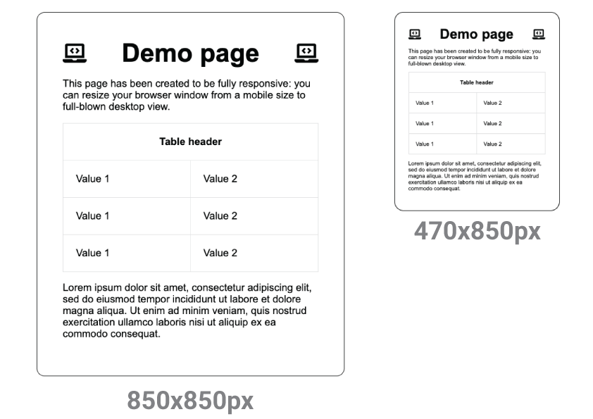
Click here to view the full demo page.
Do you have a comment or just send kudos our way, get in touch with Valentina or Tom.